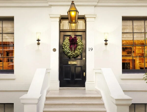
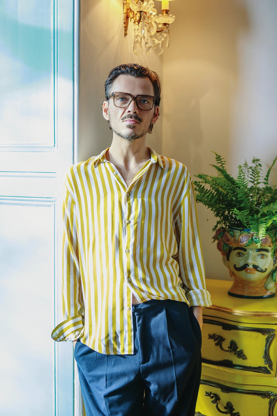
Matthew Williamson is the undisputed king of colour and nowhere is this better reflected than his joyful apartment in Belsize Park in north London. Here the fashion-turned-interior designer – who has recently written a book about how to embrace rich tones and bold patterns – talks to The Glossary about his creative journey and how to lift your interiors and live bright.
 Pin
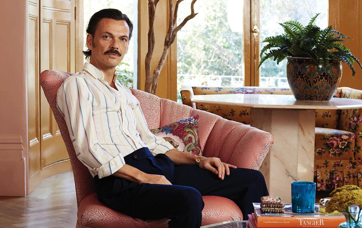
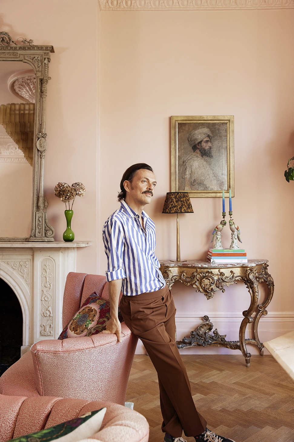
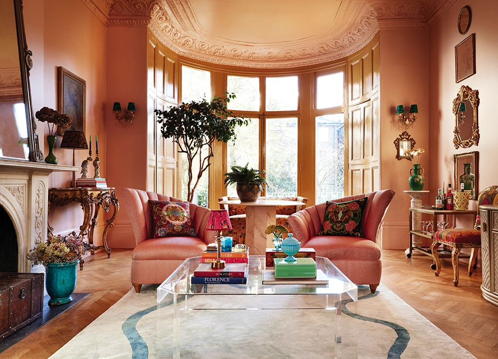
Pin When talking about his Belsize Park home, Matthew Williamson describes it to me as a “Pandora’s box”, a space that’s full of surprises, where the tomato red hallway leads to a huge barrel-shaped living room with a high ceiling and an enormous bay window, complete with original parquet flooring, cornicing and architraves. “It’s definitely the wow factor. People walk into the lounge and gasp because of its scale. It was very difficult to get it wrong as I started with great bone structure; what I did was cosmetically enhance it to give it personality. I coloured it.”
The fashion-turned-interior designer – who shares the apartment with his partner of 30 years Joseph Velosa and their daughter Skye, seven – adores colour, describing himself as “neutral shy”. Indeed, over the past three decades of designing clothes and then rooms, he has built up an unmatched reputation for his clever use of rich jewel tones, bold patterns and statement prints. So much so, he has written a book on the subject called Living Bright. Part practical guide, part memoir, it’s described as a hardworking handbook designed to help readers find their own style and encourage them to embrace the paint pot. “It’s not about the science or technicalities or theory of colour, it’s much more about the art of colour,” he explains.
 Pin
Pin As well as detailing how Matthew’s relationship with colour has developed since he was a young boy growing up in Manchester (there are some lovely anecdotes about his mum Maureen and her flair for maximalism), it’s full of advice, with each chapter devoted to a different hue. “I was keen to make it personal, so I talk about my experiences with that colour and what I like about it, any mistakes I’ve made, just to show the reader that we’ve all got our own take. I don’t believe there’s a right or wrong way – your home is for you.”
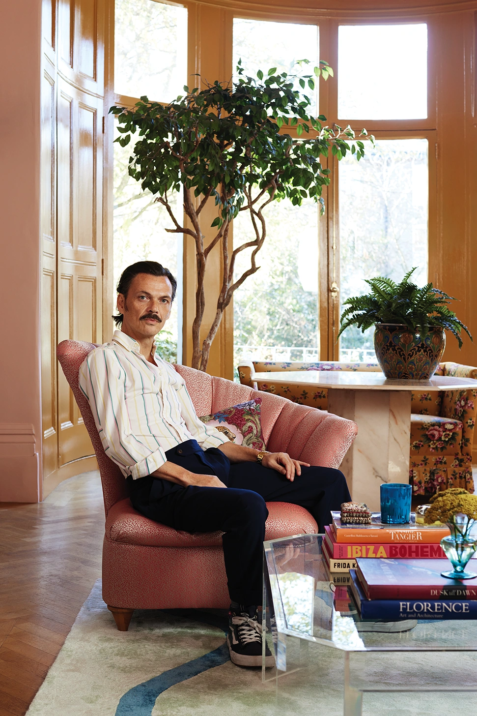
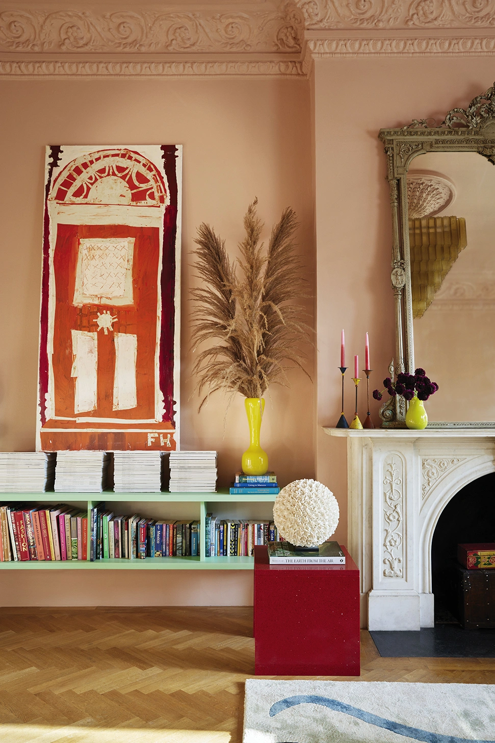
Within the pages of the book, we also get a tantalising glimpse of Matthew’s homes, past and present, in both the UK and Spain (he also has a finca in Mallorca and when we speak, he’s in the midst of choosing colours for the kitchen), his shop and projects he’s completed for clients. But it’s his ground-floor apartment in NW3 which really jumps out, not least the living room. Matthew’s instinctive decorating eye has brought the space to life, starting with the soft blush walls in a shade called Lido Pink from The Pickleson Paint Co, which is run by Rachael Green and her partner Alex Kirby (the bay window is painted in the brand’s Hackney Gold, chosen to highlight the greenery beyond). “They know their colours – their palette is not exhaustive, it’s really edited down and when you choose a colour, I guarantee it will work.”
Matthew Williamson
 Pin
Pin But why pink, I ask. “It comes back to my anxiety around neutrals, I just don’t know how to use them, and I am not saying that to be contrary,” he says. “If I paint a room white, I feel like I’m at the dentist; if I paint a room cream, it feels old-fashioned; if I paint a room grey, it feels cold. I understand that people think they work but for me this pink is so subtle. In fact, I don’t even see it as pink, it feels like a warm beige.”
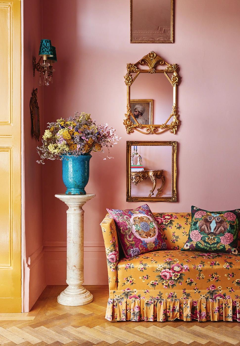
Gilt mirrors adorn the walls and antique finds, interesting pieces of furniture and characterful fabrics enhance the cosy-calm of the space. The artwork is delightfully eclectic. One of Matthew’s favourite pieces is a huge orange painting of a front door by Florence Hutchings that’s propped on piles of books. “Choosing art is down to an emotional connection, it could be the colour or the form you love,” he says. “I like the way this painting is so naive, but the rest of the lounge is so precise.” Another of his standout pieces is the vintage chandelier that he’s had for over 20 years, which “hangs like an upside-down pyramid of amber glass”.
 Pin
Pin When sourcing vintage, Matthew likes Vinterior – “they have a great network of suppliers so if you want something specific, it’s a good one-stop-shop” and Anemone Interiors in West Sussex. “It’s run by my friend [Lia Briamonte] who does a cool Miami-meets-Italy take on interior homeware.” You’ll also find him trawling markets and browsing Liberty London “even if it’s not to buy, just to daydream and see how they curate things – they have a very good eye.”
What you certainly won’t see amongst the antiques and art works in the apartment are big, bright plastic boxes overflowing with Skye’s stuff. Instead, Matthew has repurposed containers, such as a fruit crate for her books and a galvanised bucket for crayons and paints, while a carved wooden chest houses the bulkier toys. “I am very meticulous; I like things to be where they’re meant to be. I’m not an easy breezy homeowner,” he tells me. “Skye’s seven now, so she’s a bit more understanding of that. We’re quite disciplined – she has her room, her wardrobe, her bed, her space. Rather than letting kids take over, you can strike a balance. It’s all about editing and managing.”
Matthew Williamson
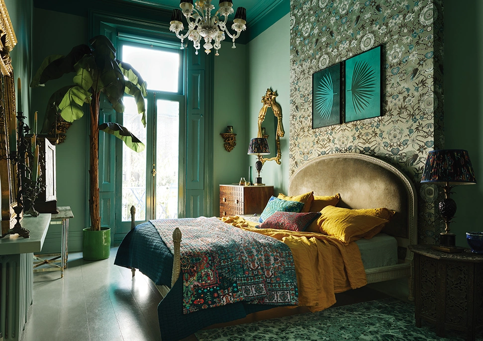
Along the hallway, the walls of Matthew’s bedroom are Pickleson Paint Co’s Tequila Green, with the ceiling, shutters and skirting board in a darker gloss, while an eclectic mix of rugs, artworks, bed linens and plants all work together, unified by the colour green. It’s a hue Matthew describes as one of the most versatile when it comes to interiors. “From jade and jewel tones right though to sage and softer greens, green is a friendly colour to use – it feels connected to nature and can be both invigorating and restful,” he says.
I ask him whether using colours can make us feel a certain way. “I don’t know about the actual effects of colour on the human body or the science behind it – or even if there is science behind it – but I would certainly go as far as to say I feel happier living against certain colours. It’s quite an abstract subtle feeling. And we all see colours differently, that’s also interesting,” he continues. “My bedroom in Spain, for example, is yellow. When I wake up in the morning it feels like sunshine, and when I go to bed at night with the table lamps on, it feels golden. It works for me, but the next person might find it a horror show.”
 Pin
Pin Although Matthew says he feels he was born with an in-built curiosity about colour, a fascination that was nurtured by his parents, it wasn’t until he did a four-year BA honours degree in fashion design and textiles at Central Saint Martins that his confidence grew, and he began to find his creative feet. A work placement at Zandra Rhodes’ design studio and regular trips to India followed, all serving as inspiration for his own first fashion collection, ‘Electric Angels’, in 1997.
Featuring models including Kate Moss, Jade Jagger and Helena Christensen wearing bias cut dresses in tangerine, cerise and aqua, it catapulted Williamson into the limelight and he quickly built up a loyal following for his bright, empowering designs, garnering numerous fashion awards and celebrity fans along the way (Sienna Miller, Kiera Knightley, Olivia Palermo…). In 2005, he was made Creative Director at Emilio Pucci.
 Pin
Pin But after two decades in the industry – and a few forays into designing homewares collections – Williamson found himself drawn towards interior design. “I had 20 years of fashion under my belt and felt that was a good marker in the sand – I thought, ok time to move on,” he says. “It was a slow pivot towards an industry that I felt would be welcoming. I felt I had enough design intel and had already done a few collaborations, so it was a no-brainer. Now I am dressing rooms as opposed to people.”
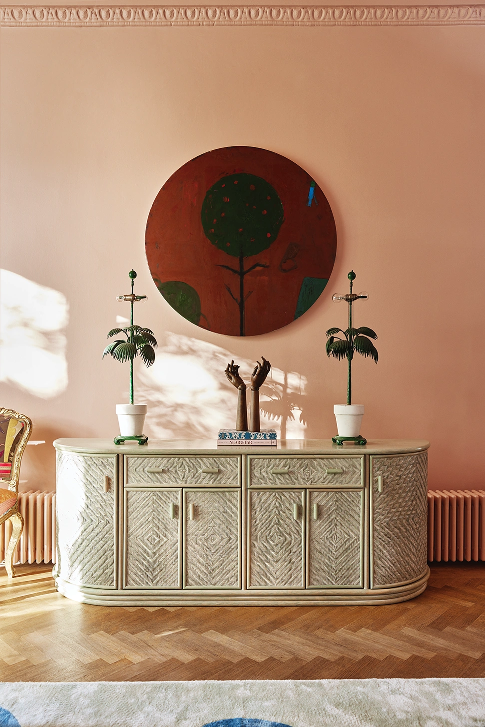
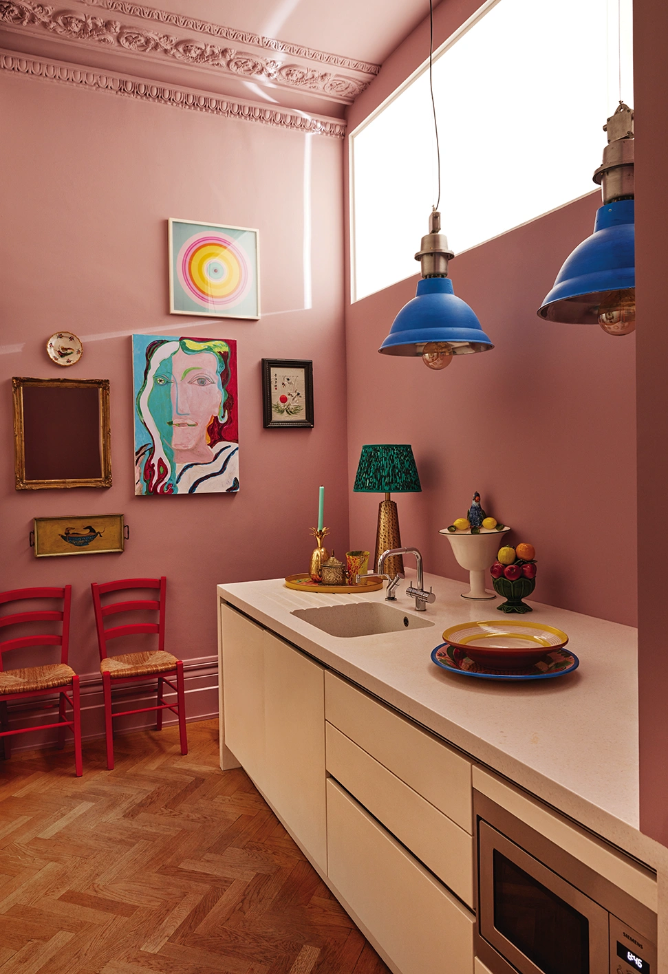
These days, his projects are both private and commercial – he was recently commissioned by the Design Museum in Kensington to create a space within the iconic John Pawson modernist building. He also currently has collections with John Lewis, Pooky, Osborne & Little and Les Ottomans, and will be launching a SS24 collection with John Lewis. “If you pushed me to describe my style, it would be rustic-decadence,” he says. “On the one hand it’s got this hand-done, crafted quality – it’s not too perfect – but then at the same time I love grandeur and opulence. When I’m working on a project, I think of those two words and how I can get a balance in a space. That to me is when it comes to life.”
 Pin
Pin Is there anyone he looks to as a source of creative inspiration when it comes to colour, I wonder. “It chops and changes all the time; I am like a magpie. I don’t have a consistent colour hero, although I like the work of the artist Dan Flavin who creates these contemporary light installations using neon tubes. And I love how the painter Gary Hume combines colours. I’d also say the Mexican architect Luis Barragán, who would use a couple of tones in his structures – hot pinks and oranges and reds.”
Matthew also mentions photographer Kate Bellm, a friend and neighbour of his who owns a hotel called Corazon in Soller, Mallorca. “She’s just opened it to a great fanfare of acclaim – I love the way she’s used colour throughout the hotel, it’s super subtle.” And on that note, I leave him to get back to choosing the colours for his kitchen. Whatever he decides, one thing is for certain – it will be unexpected and uplifting, as only Matthew knows how.
Matthew Williamson’s Design Rules
From layering colour to incorporating maximalist prints, how to lift your interiors and live bright
Find your ‘design DNA’
“It can be easy to get lost in your phone as you end up looking through four million pictures of kitchens or whatever – I often find that this can be a labyrinth to nowhere. So my suggestion is that you have a brainstorm before starting an interior design project and visually lay out markers that point towards your design style in order to understand and, more importantly, to see laid out in front of you exactly what it is that you love.
Ask yourself some key questions: ‘Who are the artists you love?’ ‘What fragrance do you wear?’ ‘Your style icon?’ ‘Do you have a favourite decade?’ Find an image that reflects your responses and build a visual board of all these things. Hopefully this distillation will steer you and help you act more instinctively when making design decisions, with greater clarity and confidence. Our styles and tastes do and should evolve but a board like this will be a good reflection of who you are today and what your creative ideas and inspirations are.”
 Pin
Pin Layering colours
“If you don’t know where to start, pick a colour and paint the whole room in that tone, creating a solid backdrop. I wouldn’t go for bold, bright, deeply saturated colours if you’re anxious, lean towards softer tones. And then work into the room; much like creating a painting, you do the background, then the mid-ground, then the foreground. Use a complementary but slightly bolder colour for the bulkier items in the space such as beds, sofas and large pieces of furniture to ramp it up a bit. And then I’d reserve an even brighter colour to pick out and highlight smaller decorative items such as paintings, lampshades, cushions and vases. Much like picking a pair of earrings or a bag to finish off an outfit.
When thinking about colours that work well together, I like to snap palettes and patterns that catch my eye on my phone, so they’re stored and ready to use when inspiration is needed. Another way is to go and find something you love – maybe it’s the colours combined on a china plate in your kitchen or a printed silk scarf your mother gave you or the palette from a much-loved artwork. Something that will make you go, ‘Oh I like those colours, they make sense to me.’”
 Pin
Pin Mixing colour and pattern
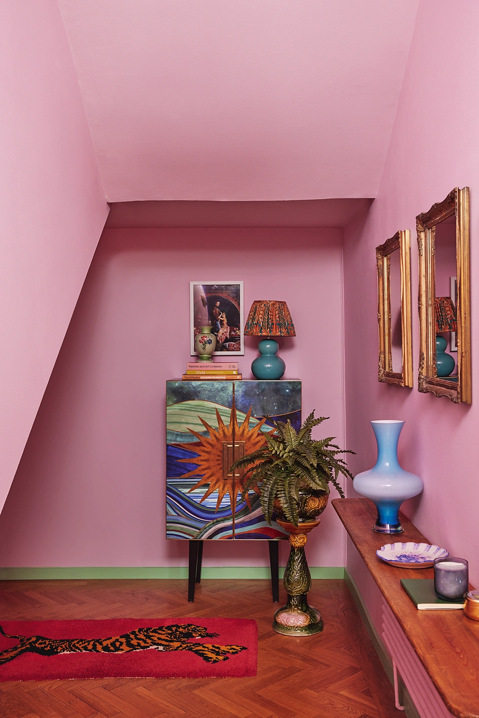
“With maximalism in mind, I wouldn’t rule out combining any types of patterns, as it’s precisely in this kind of curated mix that you’ll create something unique. A floral pattern never seems to fail – blowsy and bold or delicate and ditsy, it always adds an air of whimsy, romance or drama to a space. To contrast with a floral, I’d head towards something more graphic such as a check or stripe, which invariably looks sharp. As in so many areas of design, things that come in threes always work well, so I’d add a third print such as an animal spot or classic ikat – both timeless. When it comes to using colour across a mix of patterns, a good tip can be to refrain from using too broad a palette. Mix up your prints freely but keep the palette tight – say a maximum of six colours – to create a harmonious core. Don’t veer away from that as you might get into a pickle with too much going on. It’s about both freedom and restraint.”
 Pin
Pin Incorporating contemporary with vintage
“My rule would be don’t stick to one era. To me it’s a red flag if everything is from the same genre. I quite like looking at those rooms that are very disciplined, but they don’t speak to me in terms of comfort and pleasure. It’s all about balance – if something contemporary is featured prominently, I’ll pair it with something old. I’ve always believed that when you combine items from different eras and genres it’s in that mix you create a space that has soul.
Keep an open mind and source what you love from different decades. I tend to be on the more elaborate side of things – I love all the decadence of gold and gilt and brass and shine but I also want to mix that with something raw or rustic or more natural. So, I suggest you have fun mixing things up. While it may take a little longer, you’ll be sure to create a space with more character, that’s uniquely yours.”
Living Bright by Matthew Williamson (Thames & Hudson, £30)
matthewwilliamson.com
