In her new book Kaleidoscope, The Glossary’s Interiors Editor Amy Moorea Wong explores ways to assimilate colour into a space. In this edited extract, as well as showcasing some of London’s most eye-catching homes, Amy talks to the designers, stylists and creatives behind them on how best to embrace rainbow, life-affirming hues indoors.
CANDICE LAKE
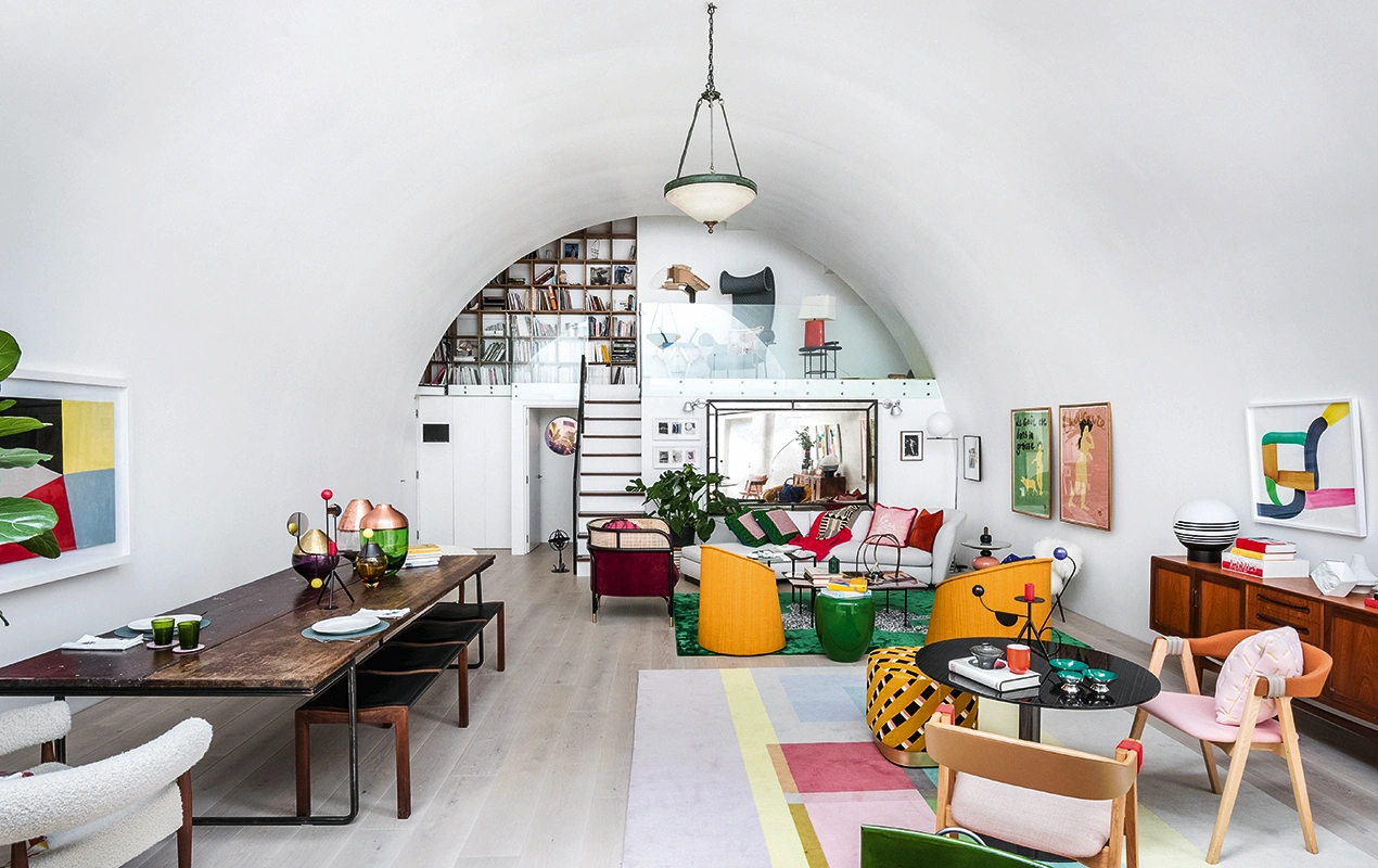
Fashion photographer Candice Lake’s home was forged from a disused railway arch in Kennington, south London, which her husband Didier Ryan, architect and founder of Undercurrent Architects, transformed into a habitable house – the city’s first residential arch
 Pin
Pin I didn’t say “Let’s make a multicoloured space here” – it just happened. I started very, very gently, began adding and adding and adding and the colour just sort of grew. My method was to bring in a bright chair and live with it to test it out – it was a discovery process. The house is bold, it’s unapologetic and it’s loud, but it’s also very considered. I didn’t choose anything just for the sake of having colour – the palette almost formed on its own.
The reds, blues and yellows make the house feel warm and welcoming, and when the day is a bit grey, they’re utterly joyous and uplifting. Anything purple is banished from my home – I have always had a deep aversion to it. I love to dress in orange, although I find it also a bit offensive in interiors. I like to bring in colour with big objects, as they create intensity and a sense of magic. Trying to make changes with small knick-knacks is a mistake.
 Pin
Pin  Pin
Pin I really felt strongly about keeping the walls a blank canvas, and with that you have to make very brave colour choices. I filled each area with colour using objects that can be removed and changed – I don’t think I would ever touch the walls, as you need the neutrality to emphasise the brightness. Imagine how overwhelming it would be if they were painted.
 Pin
Pin  Pin
Pin If you want to experiment with textures, colours and prints, start in the guest loo. I love peeking into them when I’m at a friend’s house as it is usually where you find the true spirit of the homeowner. A lick of bright paint is a quick and easy foray into a life filled with colour – it instantly transforms a room (and you can always paint it back). Also, reupholstering a second-hand sofa in a bright fun fabric is a wonderful way to experiment.
Don’t be afraid to be bold. Buy pieces you love, and the room will inadvertently come together. Colour is exciting and a brilliant way to bring happiness into your interiors – take risks and play with it, it’s fun!
Photography: Taran Wilkhu

TRIFLE & FLOOR STORY
The east London Victorian home of Emma Morley, founder and creative director of commercial interior-design practice Trifle, and Simon Goff, owner of contemporary rug brand Floor Story, is filled with narrative, with each room different in terms of design and vibe
 Pin
Pin  Pin
Pin People say coming to our house feels like being on holiday, which we love. Our travels around the world have hugely influenced the look, feel, design and palette of our home. Some of it is more subconscious and subtle, and some more direct, but I don’t think you’d walk into our house and think that the colours are classically ‘British’.
Certain elements of Spanish and Moorish culture have influenced our style. We look to El Fenn in Marrakech for colour inspiration, as well as the Gubi flagship store in Copenhagen and the Alhambra in Granada. Also, Mexico and Colombia in general are filled with incredible colour combos.
 Pin
Pin  Pin
Pin Year upon year we have added more colour. We push ourselves to be brave – why say it when you can sing it? That said, it’s advisable to stick to three complementary tones. When it comes to painting our walls, we’re not very brand loyal – we love Little Greene, Valspar, Dulux, Farrow & Ball and Paint & Paper Library.
The colours we’ve chosen have a calming effect, which is important to us as we’re in an urban environment. When we walk in from busy, bustling, stressful days, it makes us feel relaxed. It’s our happy place. As much as we like to travel, we always love coming back home.
 Pin
Pin  Pin
Pin A room without a rug is not a complete room. They bring warmth and soul, and are a brilliant opportunity to gamble a little and lay down some personality with colour and design. You can be brave and have fun with them.
Go bold in a small room first – pick an object that you love and design the décor around that. And don’t panic if you hate it initially. Live with it for a while and see if you get used to it (sometimes a change is a shock). You can always repaint it. And remember to sample the hell out of stuff! Use tester pots to paint A4 sheets of paper, try them on different walls and make sure you look at them throughout the day in different lights.
Photography: Simon Bevan; Styling: Harriet Drohan

EARL OF EAST
For Niko Dafkos and Paul Firmin, co-founders of lifestyle brand Earl of East, their home in east London is a place to experiment in, an evolving aesthetic that doubles as a location for photographing soon-to-be sold design pieces
 Pin
Pin  Pin
Pin When people say they’re afraid of using colour, often it’s knowing how to put shades together – start with one or two tones that you like, and they can become a common link through the home. You can be big and bold, but there are ways to add colour to a house without it being too over the top.
Whenever the time is right – and the budget is available – we refresh a room and move it on to the next phase. We always look at Farrow & Ball. The paint is consistent and there’s a great narrative behind the colours – they feel like they stand the test of time.
 Pin
Pin  Pin
Pin Textiles are a quick, easy and affordable way to change the interior space. We have more cushions on the bed than we’ll ever need. And green life – plants and the odd bunch of flowers are great for the mood, as well as for making a space feel cosier.
When you’re adding accessories, use groupings. Have a trio (or other odd number) of objects and create landscapes with taller and shorter heights. It just looks more interesting that way. In our house, we’ve used artwork to add a surprise hint of colour. We have pieces all over – behind doors, at the top of the stairs, leaning against walls …
 Pin
Pin  Pin
Pin We love going to independent stores when we travel for colour inspiration, and we always like to go to the conservatory at Barbican for a hit of green. The thread that runs throughout our place is a natural take on colourful shades that work together to emit a calmness, so the home becomes a sanctuary.
Photography: Simon Bevan; Styling: Harriet Drohan

SELLA CONCEPT
Tatjana von Stein is founder and creative director of interiors-and-design studio Sella Concept. Her apartment, which she shares with wife and business partner Gayle Noonan, is set across the top two floors of a Georgian house overlooking Hampstead Heath
 Pin
Pin Colour is such an easy way of adding ambience to a space. At the moment my colours are calm, subdued and smooth. I like to combine terracotta with any colour because of its warmth but I don’t tend to be drawn towards the particularly bright, although that will probably evolve. Once you start working with colour, it’s quite hard to go back.
I love being fully immersed in a space, so I rarely leave ceilings white – using all-over colour creates a full background so the room can focus on how everything moves together. Non-white ceilings are a step away from the more traditional British houses, which usually have that very separated look – I think white just draws attention to the ceiling. Corridors, too, benefit from colour to bring them to life as these are often the darkest corners of the house.
 Pin
Pin  Pin
Pin When you think of colour, don’t only think about primary colours – there are so many gorgeous, sensual shades that are incredibly subtle, but which make a huge difference in the home. Soft colours aren’t just backdrops; they are atmosphere.
Mix old and new when accessorising; let table lamps and paintings do a lot of the talking. The more colourful the walls, the more gorgeous colourful paintings look.
 Pin
Pin  Pin
Pin I try to avoid rules – each room should have its own motto. If I’m looking for colour inspiration, I go to my grandmother’s flat in Paris, which sings with yellows and lime greens across silk walls, carpets and all-over patterns.
Photography: Simon Bevan; Styling: Harriet Drohan
This is an edited extract from Kaleidoscope: Modern Homes in Every Colour by Amy Moorea Wong (Hardie Grant, £33) out now